Category: Heraldry

  • “When in Europe – don’t miss Skurup”

    “When in Europe – don’t miss Skurup”

    The coat of arms of Swedish municipality Skurup was replaced by a logotype in 2007. In 2025 the logotype was once again replaced by another logotype.

    The municipality of Skurup was formed in 1971 when the market town of Skurup was merged with Rydsgård and Vemmenhög.

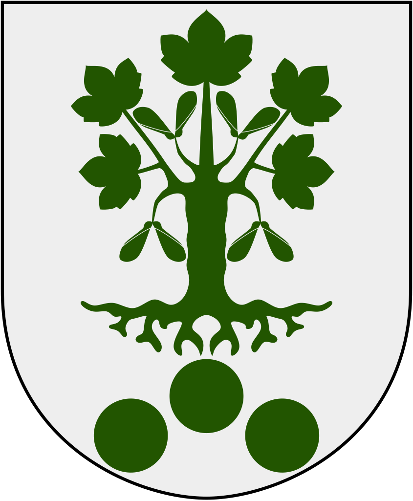
    The proposal for the municipality’s coat of arms was created by the artist Östen Nilsson in collaboration with The Swedish National Archives. The decision on the matter was made in 1986 by then National Archivist Sven Lundkvist after a presentation by the State Herald Clara Nevéus.

    Blazon: Argent, a German maple tree vert, beneath three roundels vert arranged one and two (in Swedish: I fält av silver en grön tysk lönn, nedan åtföljd av tre gröna rundlar ställda en och två).

    The colors of the municipal coat of arms and the three roundels are taken from the Vemmenhög Hundred’s coat of arms, known from the 17th century. The roundels likely refer to ancient graves in this area. The German maple tree (Acer pseudoplatanus) resembles the tree on Zimmermans backe, a nature reserve and a well-known viewpoint in the municipality.

    The coat of arms of Skurup municipality from 1986. From Wikipedia.

    From coat of arms to logotype

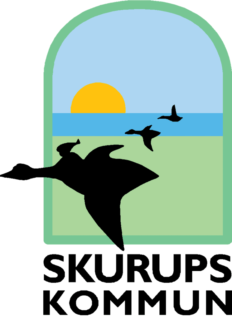
    Back in 2007, Skurup replaced the coat of arms with a new logotype, featuring Nils Holgersson from The Wonderful Adventures of Nils by Selma Lagerlöf – the first woman to receive the Noble Prize in Literature. In the book, Nils begins his adventure in Västra Vemmenhög, today part of Skurup. The logotype was introduced already in 2001, as part of a new marketing concept to “make the municipality visible and attractive”. In the logotype, designed in the form of a window, Nils Holgersson is placed as the central figure, flying on his goose with the green plains in the foreground. In the background, the sea, sky, and sun are visible.

    The logotype of Skurup municipality, created in 2001. From the previous branding hand-book of Skurup.

    Change of logotype – again

    Since the summer of 2023, the municipality has been working once again on replacing its municipal trademark. There were several reasons for this decision, one of which was that the municipality felt its self-image no longer aligned with the portrayal in Selma Lagerlöf’s book about Nils Holgersson’s adventure.

    “It’s a children’s book, and we are an expanding municipality with a lot of new residents; it doesn’t quite match how we want to present ourselves to the outside world,” the municipality’s head of communication said back in 2023.

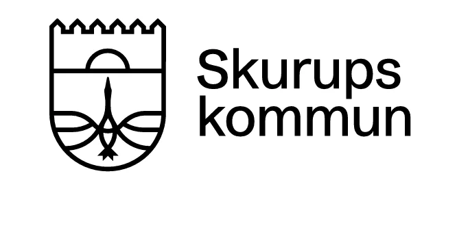
    On January 21, 2025, the new logotype was finally revealed. While Nils Holgersson has been removed, the goose remains a prominent feature. The choice of the goose is particularly notable, as Skurup municipality is known for its own “municipal bird” – the rook. Additionally, despite already having a coat of arms, the new logotype is designed in the shape of a coat of arms.

    The new logotype from 2025. From the Skurup municipality website.

    Critics of the new logotype argue that the municipality should preserve its connection to the classic children’s book. However, Johan Bolinder, the chairman of the municipal board, says in an interview with Swedish public service television that it is time for the municipality to stand on its own.

    So, why not use the existing coat of arms instead? The decision to change the 2001 logotype instead of simply using the existing coat of arms is beyond my understanding, especially since the coat of arms could have been adapted into the same minimalist style.

    In recent years, we’ve seen both positive and negative examples of how municipalities handle their coats of arms. Uppsala municipality made a major misstep by disastrously altering its coat of arms, effectively transforming it into Linköping’s, while Arboga municipality handled theirs flawlessly.

    As a side note, the municipality is also home to one of the most unique municipal slogans in Sweden, which inspired the title of this post: “When in Europe, don’t miss Skurup.”

    Sources:

    https://www.skurup.se/download/18.61a1602c18afe90760a12f4/1696587148208/Grafisk-profil_2021_09-WCAG.pdf

    https://www.svt.se/nyheter/lokalt/skane/klubbat-nu-sager-skurup-farval-till-nils-holgersson-bedrovligt

    https://www.svt.se/nyheter/lokalt/skane/skurupsloggan-ska-andras-inte-var-identitet-langre

  • Trinidad & Tobago re-designs coat of arms to remove ships of Columbus

    Trinidad & Tobago re-designs coat of arms to remove ships of Columbus

    Trinidad and Tobago has officially unveiled a redesigned version of its national coat of arms, making a significant departure from its historical depiction. The updated design removes the ships that were once associated with Christopher Columbus.

    The original coat of arms, adopted in 1962 following the country’s independence, prominently featured three ships – Santa Maria, La Pinta, and La Nina – a nod to Columbus’ 1498 landing on the islands. The ships symbolized the European discovery of the islands, a legacy that many Trinidadians and Tobagonians recently have begun viewing as a painful reminder of colonization and the negative impacts on indigenous populations.

    Photo: The old design featuring the three ships of Columbus.

    In August 2024, Prime Minister Keith Rowley announced at the annual convention of the People’s National Movement that his government planned to remove Christopher Columbus’s sailing ships from the coat of arms and replace them with the steelpan drum, the national musical instrument. A bill to do so was passed in the House of Representatives and Senate in January 2025, and received assent from the President of Trinidad and Tobago on 29 January. Gillian Bishop was tasked with the new design, which was unveiled on 19 January 2025. On 21 February 2025 the proclamation was issued giving effect to the new design, which came into use from 25 February 2025.

    Photo: The new design featuring the steelpan.

    The crest depicts a ship’s wheel in front of a palm tree. This palm tree had always been the central figure on the Great Seals of British Colonial Tobago. The escutcheon is divided by a chevron and is comprised of the same colours as the nation’s flag – red, black and white – symbolizing fire, earth, and water. The two birds on the shield are hummingbirds. Trinidad is sometimes referred to as the “Land of the Hummingbird”. A gold steelpan, the national instrument of Trinidad and Tobago, with two pan sticks are featured below the birds. Supporting the shield are the scarlet ibis, the national bird of Trinidad, and the cocrico, the national bird of Tobago. The compartment depicts two islands arising from the sea. Below the scarlet ibis are three hills, representing the Trinity Hills in Trinidad, which, according to legend, convinced Columbus to name the island “La Isla de la Trinidad” after the Holy Trinity. The island rising out of the waters beneath the cocrico represents Tobago. Below is the nation’s motto, “Together We Aspire, Together We Achieve.”

    Sources: Trinidad Express, Government of the Republic of Trinidad & Tobago, Life in Trinidad & Tobago, The President of the Republic of Trinidad and Tobago

  • New royal coat of arms ends 600 year old conflict

    New royal coat of arms ends 600 year old conflict

    On December 20, 2024, King Frederik X of Denmark issued a royal resolution establishing a new royal coat of arms. This updated design builds on the coat of arms created by his mother the Queen in 1972, with the new King aiming to craft a more contemporary symbol that honors both the heritage of the Realm and the rich traditions of heraldry. Yesterday, on January 1, 2025, the new coat of arms was officially published to the public, marking the beginning of its use in official and ceremonial contexts.

    The royal coat of arms serves as both The King’s personal emblem and a national symbol of the state. Its origins trace back to the reign of Canute IV, whose great seal from around 1194 is the earliest known representation. Since then, the royal coat of arms has evolved in various forms, consistently symbolizing the legitimacy and sovereignty of both the monarch and the state. Today, it is prominently used on official documents and seals, including those stamped on royal appointments and original laws.

    The changes to the coat of arms maintain continuity with the previous design, established in 1972, but also introduce significant alterations. The most notable of these is the incorporation of separate fields for Greenland and the Faroe Islands, reflecting the territories’ distinct identities within the Danish Realm. The escutcheon is divided into quarters by the Dannebrog Cross. The first quarter features the coat of arms of Denmark, originally the arms of the House of Estridsen. It consists of three blue, crowned lions surrounded by nine red hearts on a gold field. The second quarter displays the arms of the Faroe Islands, a ram on a blue field, and the third quarter presents the arms of Greenland, a polar bear on a blue field. The royal household states in a press release that by giving the Faroe Islands and Greenland their own distinct fields, the new coat of arms “strengthens the prominence of the Realm.”

    The new design marks the end of a 600-year tradition by removing the three crowns. Originally, the three crowns were the national symbol of Sweden, dating back to the 1300s and the reign of King Magnus Eriksson, who ruled over Sweden, Norway, and Skåne. The emblem represented this union. Later, in 1397, it became a symbol of the Kalmar Union, which united Sweden, Denmark, and Norway under a single monarch. However, when Sweden left the union in 1523, both the Swedish and Danish kings claimed the right to the three crowns—Sweden as a symbol of its own sovereignty and Denmark as a reminder of the Kalmar Union. This disagreement led to wars, including the Northern Seven Years’ War (1563–1570). It wasn’t until the peace negotiations following the Kalmar War in 1613 that the two countries reached an agreement: both monarchies would retain the right to use the three crowns, and further conflict over the symbol would cease. For the next 400 years, every Danish monarch exercised this right – until now, that is. In the same press release mentioned above, the Royal House of Denmark writes that “the symbol of the three crowns has been removed from the coat of arms, as it no longer has a current character and is therefore not considered as relevant”.

    Photo: Kongehuset ©

    The fourth quarter of the coat of arms now includes the two lions of Southern Jutland (Schleswig), acknowledging the historical ties between Denmark and the duchy of Schleswig. This addition pays homage to the legacy of Denmark’s former possessions in the southern Jutland region.

    The Dannebrog Cross, which divides the four fields, is now featured with its original outwardly curved design, as it appeared in earlier heraldic depictions. The revised coat of arms also includes a dynastic inescutcheon, bearing the two bars of the House of Oldenburg, reflecting the royal family’s dynastic lineage. The arms are surrounded by the collars of the Order of the Elephant and the Order of Dannebrog, while two heraldic supporters—”savages” standing under an ermine-lined pavilion topped with the royal Danish crown—accompany the shield.

    The new royal coat of arms was designed and drawn by Royal Herald Painter Ronny Skov Andersen. Personally, I wholeheartedly applaud the dedication and efforts of everyone involved in designing and updating the royal coat of arms. Their attention to detail and heraldic tradition have truly brought this symbol into a new era.

    Read the press release from the Royal House of Denmark (in English): Kongehuset

  • The Seraphim Toll for Princess Birgitta of Sweden

    The Seraphim Toll for Princess Birgitta of Sweden

    On Sunday, December 15, 2024, a Seraphim Toll was held at Riddarholmen Church in Stockholm to honor Her Royal Highness Princess Birgitta, who passed away on December 4, 2024, at the age of 87.

    The Order of the Seraphim is conferred upon members of the Swedish Royal House and, by recommendation of the government, upon heads of state or individuals of equivalent status in connection with state visits.

    Princess Birgitta was appointed as a Member of the Royal Order of the Seraphim on March 22, 1952. As part of the tradition of the Order, when a Knight or Member is conferred the honor, a heraldic coat of arms – a seraphim shield – is proposed and subsequently painted by the Chapter of the Orders.

    Since the beginning of the 19th century, Riddarholmen Church has been the designated church of the Order of the Seraphim. The seraphim shields of deceased knights and members are displayed in the church, while shields of living knights and members are kept at the Royal Palace.

    On the day of the funeral, the coat of arms of the deceased is solemnly transferred from the Royal Palace to Riddarholmen Church. The Seraphim Toll (Swedish: Serafimerringning), as this tradition is known, takes place between noon and 1 p.m., during which the great bell of the church tolls continuously for one hour, in reverence of the life and service of the departed.

    Photo: Alexandru Baboş Albabos, Wikimedia Commons

    Source: Royal Orders of Knighthood

  • New coat of arms revealed in the UK

    New coat of arms revealed in the UK

    On October 10, 2024, a new design for the UK coat of arms was unveiled, marking an important moment in the country’s heraldic tradition. This new design follows the accession of His Majesty The King, and like all changes to the coat of arms, reflects the commencement of a new reign.

    The UK coat of arms is not merely a symbol of the government; it is a representation of the royal authority upon which the government acts. By using the coat of arms, the government conveys that it operates under the authority of the Crown, and it is often referred to as “His Majesty’s Government.” The updated design continues this tradition, but with a refreshed look to match the current reign.

    Photo: The new coat of arms.

    The changes to the previous coat of arms are subtle yet noticeable. They have gone back to a classic shape escutcheon rather than an oval shape (arms of women are generally depicted not on shields but on lozenges or ovals). Also, following King Charles III’s decision to incorporate the Tudor Crown into his royal cypher, the College of Arms anticipated a similar adjustment to the crown featured on the royal arms. The Tudor Crown, also referred to as the King’s Crown, was last used officially between 1902 and 1953, and now replaces St. Edward’s Crown, the heraldic symbol that was prominent throughout the reign of Queen Elizabeth II.

    Photo: The royal cypher of Charles III.

    For practical purposes, the government uses a simplified version of the coat of arms known as the lesser arms. This version of the arms is now available in a variety of formats, including a streamlined silhouette for digital communication. The use of the lesser arms will be widespread, appearing on departmental logos, email signatures, and other official correspondence, ensuring consistency across government communications.

    Photo: The old and new lesser arms.

    As part of the transition, new departmental logos will be rolled out, with updates being made in a cost-efficient manner, beginning with digital platforms. This rollout is expected to be gradual, with updates to physical materials following later, as is customary in heraldic design changes.

    The updated coat of arms marks a subtle yet significant evolution in a long tradition of state heraldry. It stands as both a symbol of continuity and an acknowledgment of the monarchy’s evolving role in the 21st century.

    Source: Government Communication Services