The coat of arms of Swedish municipality Skurup was replaced by a logotype in 2007. In 2025 the logotype was once again replaced by another logotype.
The municipality of Skurup was formed in 1971 when the market town of Skurup was merged with Rydsgård and Vemmenhög.
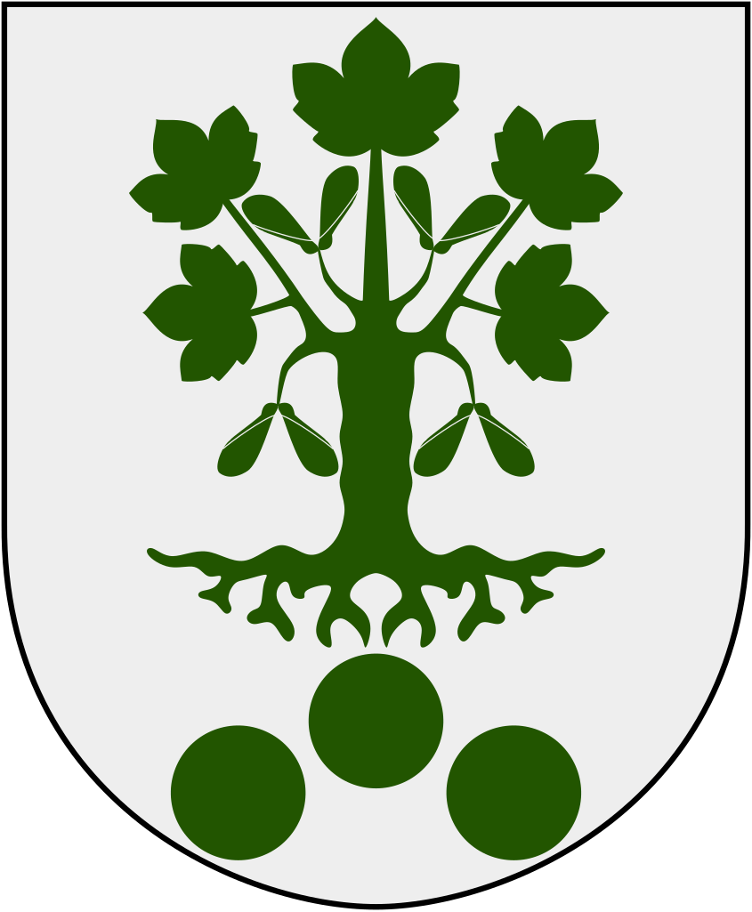
The proposal for the municipality’s coat of arms was created by the artist Östen Nilsson in collaboration with The Swedish National Archives. The decision on the matter was made in 1986 by then National Archivist Sven Lundkvist after a presentation by the State Herald Clara Nevéus.
Blazon: Argent, a German maple tree vert, beneath three roundels vert arranged one and two (in Swedish: I fält av silver en grön tysk lönn, nedan åtföljd av tre gröna rundlar ställda en och två).
The colors of the municipal coat of arms and the three roundels are taken from the Vemmenhög Hundred’s coat of arms, known from the 17th century. The roundels likely refer to ancient graves in this area. The German maple tree (Acer pseudoplatanus) resembles the tree on Zimmermans backe, a nature reserve and a well-known viewpoint in the municipality.

From coat of arms to logotype
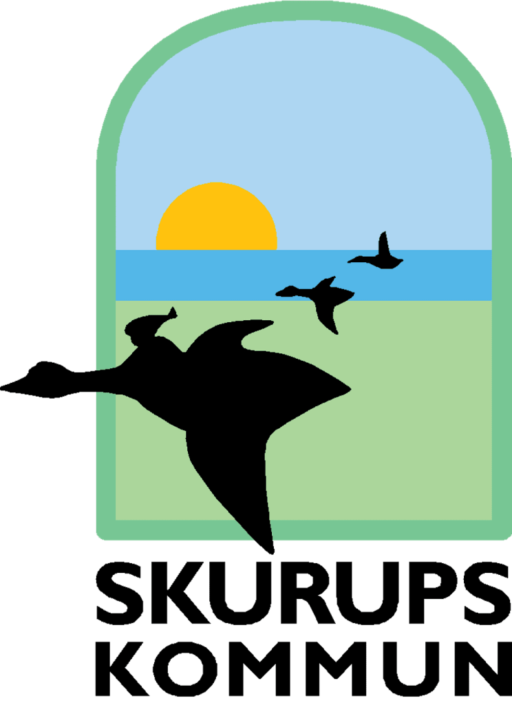
Back in 2007, Skurup replaced the coat of arms with a new logotype, featuring Nils Holgersson from The Wonderful Adventures of Nils by Selma Lagerlöf – the first woman to receive the Noble Prize in Literature. In the book, Nils begins his adventure in Västra Vemmenhög, today part of Skurup. The logotype was introduced already in 2001, as part of a new marketing concept to “make the municipality visible and attractive”. In the logotype, designed in the form of a window, Nils Holgersson is placed as the central figure, flying on his goose with the green plains in the foreground. In the background, the sea, sky, and sun are visible.

Change of logotype – again
Since the summer of 2023, the municipality has been working once again on replacing its municipal trademark. There were several reasons for this decision, one of which was that the municipality felt its self-image no longer aligned with the portrayal in Selma Lagerlöf’s book about Nils Holgersson’s adventure.
“It’s a children’s book, and we are an expanding municipality with a lot of new residents; it doesn’t quite match how we want to present ourselves to the outside world,” the municipality’s head of communication said back in 2023.
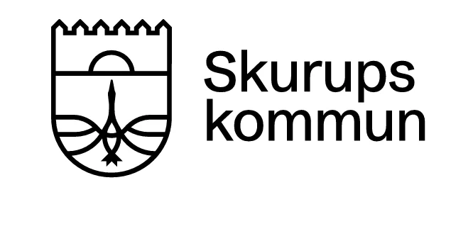
On January 21, 2025, the new logotype was finally revealed. While Nils Holgersson has been removed, the goose remains a prominent feature. The choice of the goose is particularly notable, as Skurup municipality is known for its own “municipal bird” – the rook. Additionally, despite already having a coat of arms, the new logotype is designed in the shape of a coat of arms.

Critics of the new logotype argue that the municipality should preserve its connection to the classic children’s book. However, Johan Bolinder, the chairman of the municipal board, says in an interview with Swedish public service television that it is time for the municipality to stand on its own.
So, why not use the existing coat of arms instead? The decision to change the 2001 logotype instead of simply using the existing coat of arms is beyond my understanding, especially since the coat of arms could have been adapted into the same minimalist style.
In recent years, we’ve seen both positive and negative examples of how municipalities handle their coats of arms. Uppsala municipality made a major misstep by disastrously altering its coat of arms, effectively transforming it into Linköping’s, while Arboga municipality handled theirs flawlessly.
As a side note, the municipality is also home to one of the most unique municipal slogans in Sweden, which inspired the title of this post: “When in Europe, don’t miss Skurup.”
Sources:
https://www.svt.se/nyheter/lokalt/skane/skurupsloggan-ska-andras-inte-var-identitet-langre
